Divers

Entries feed

Industrial design : creative process of Donn Koh

Donn Koh is an industrial designer from Singapore. His experiences led him to work with a lot of prestigious companies, and to found his own studio in 2010 with 4 other (very talented too) designers.
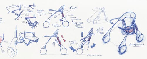
His Behance portfolio is one of the most interesting I've seen since a long time. There are very varied and innovative projects, but the most interesting are the details of the creative process of the designer. Actually, before drawing the first sketch, he works a lot to define very precisely the original need. What is the use of the product ? What kind of use scenario can we imagine ? What are the problems with similar products ? This approach, very user centered, produces stunning, original and innovative solutions.
In my point of vue, this way to conceve a design project should be consistently employed, whatever the design discipline is (graphic design, product design, space design...), and especially in a multimedia design, with a lot of varied user interactions.
But let's stop digressing and let's lloking at some pictures from Donn Koh's portfolio, which I suggest you to visit.

Continue reading...

Desillusion Parano : on the road magazine

I wrote an article few months ago about Desillusion, a very beautiful french magazine dedicated to surf cultures (written in both french and english). Each time I open a new issue it's a great surprise for me to read the articles and to watch the nice graphic design, the great photographs and the magazine in itself (lot of different papers, original shapes...).
For the next issue the team had a great idea : to create the issue on the road, in a 1977 Chevrolet all over the West coast of France. Named "Desillusion Parano" in reference to "Las Vegas Parano", this next issue should be full of great encounters and nice pictures. Lucas, of the Desillusion team, sent me some of the first pictures of the trip, and you can discover it in the rest of this post, with a first video.
Pictures, link and video in the rest of this post !

Continue reading...

Munge Leung, luxury interior design

Munge Leung is an interior design firm located in Toronto, Canada. Founded in 1997, the firm specialized its work into interior design for the fields of hospitality, nightclubs, restaurants and original personnal houses. Between decoration, product design and architecture, the works contains a lot of beautiful details in a whole project, which allows the agency to work on huge proposals.
Pictures and link in the rest of the article.

Continue reading...

Between technology and jewelry : creations of Paola Mirai

Paola Mirai is an italian designer based in Milano. After several years of work as artistic director, she decided to get involved into jewelry and she created a new material called "Orotrasparente". She includes in this material pieces of old electronic objects (like printed circuits or mecanic pieces), and she gives these objects a second life and a new rank, exhibiting them at the heart of her creations. Some of her creations reminds amber necklaces in which old insects are trapped. A very original universe to discover through her site.
More pictures and link in the rest of the post.

Continue reading...

Type Union, typography, only typography

Type Union, a great website for typography inspiration, with a lot of works.

A little post about a website I just discovered via Twitter (by the way, don't hesitate to follow me) : Type Union. Created by two graphic designers having a passion for typography, this website provides a space only dedicated to this art. Several categories are available, like 3D, Experimental, Hand Drawn, Type design... The submission of a new work is extremely easy, and each project is limited to only 3 pictures and a short description. This allows a great diversity of works, in which we can see influences from illustration, graphic design or motion graphics.
An interesting website to find inspiration for new typographic compositions. By the way you can find my free font Mister Jun on Type Union on this page.
http://typeunion.net

365 creative days in 2011 !

Greeting cards of french graphic designer Clément Romier, located in Lyon, France

Some weeks ago I interviewed Mazmelle Print, community manager of the french pure player printing-house Print O'Clock. She offered me the printing of 5 000 leaflets. So I used them as my personnal greetings card, promoting my font Mister Jun (and killing two birds with one stone).
So this post is for me the place to wish a happy year to my readers, and through this translation to my foreign readers especially. I hope my english is comprehensible. In this card, meaning in english "365 creative days for 2011", I choosed to highlight creativity, because it's designed for graphic designers, but also because I think that 2010 showed a lot of opportunities and alternatives which have to be explored in 2011 !
You can see more pictures of my greeting cards in this post. Happy new year !

Continue reading...

- page 2 of 6 -