Stromae's visual identity by Bold
Clément Romier | On Google + | Graphic Design - Permalink
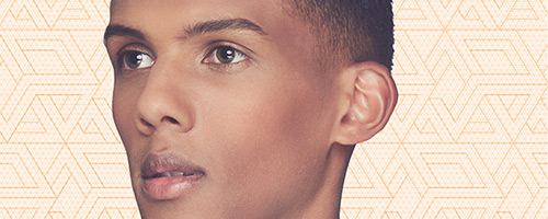
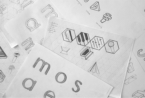
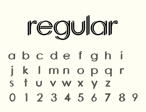
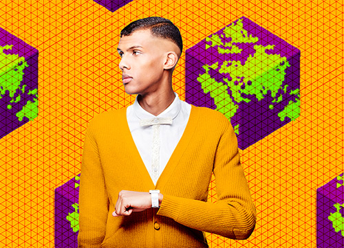
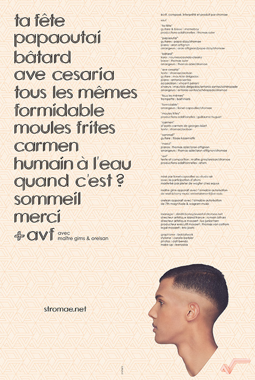
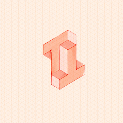
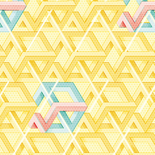
Here in France, (and I presume in some other countries too), Stromae is a very well known artist, having a large success these last years. One very special thing about him is his look, colourful and original. The artist has even launch his own apparel brand, inspired by his visual identity. And this identity is a great success in itself, with an amazing work of graphic design. The singer asked the belgian agency Bold to conceive it, and commonly they defined an isometric graphic system, inspired by Escher's famous impossible figures and african fabrics. Each song has its own pattern, based on a common grid. We can also notice the typographic work, with a special typeface derived from Century Gothic, in the same idea as the whole identity. And the icing on the cake : Stromae talks about his design agency in his interviews, something rare enough to be mentioned !

 Français
 English