Webdesign selection : Mountain
Clément Romier | On Google + | Webdesign - Permalink
I start a new type of article with this post : thematic selection of webdesigns. This kind of posts are pretty classic and you can find a lot of examples on blogs, but there are a lot of themes that nobody talk about. By example : mountains. Maybe you wonder why making a selection of webdesigns about such a theme, but I had to make it for a professionnal project and I thought it was a good idea to share it with you some of the most interesting websites. By the way, feel free to share interesting websites you bookmarked in the comments.
Keep Exploring
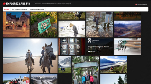 A nice tourist canadian website, built as a photo reporting. The photographs series are sorted by themes and regions. There are very good shots and the whole allows the user to immerse into the travels.
I-mtb
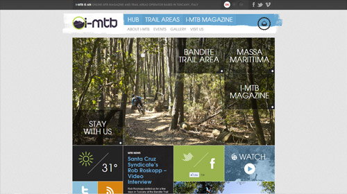 This mountain bike dedicated website is built around a strict layout grid, but the great use of photographs and the choice of colours give more fun to the whole. A very clear and functionnal website, with a strong graphic identity.
Created by Roomfive.
Millet
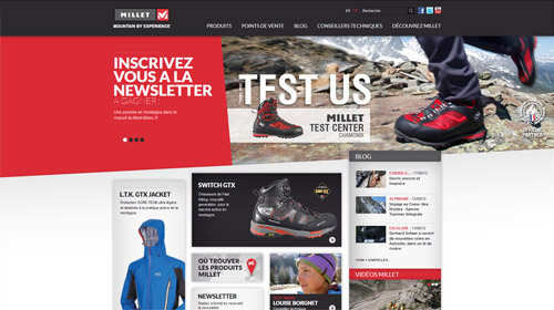 Millet is a great french brand of mountain sport gear. The sober but dynamic design, playing with a punchy scale of colours, conveys the quality and seriousness of the company and products. From a marketing and communication point of vue, the place dedicated to the technical consultants shows the company expertise without a classic advertising approach.
Created by La Haute Société.
MontagneTV
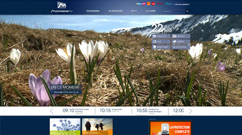 Montagne TV is a french tv channel dedicated to the mountain universe. Even if the logotype and graphic identity are very basic and common, the website in itself is interesting : The user experience, mostly on the homepage, contains good ideas to organize information.
Created by Altimax.
Auvergne Tourisme
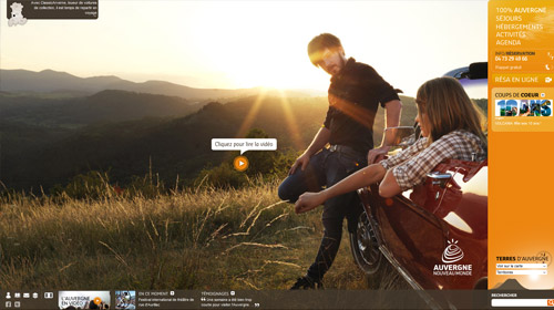 Tourist website for the french region Auvergne (a nice region of very old volcanos). Obviously, the main goal here was to seduce, specifically through nice pictures and videos. An interesting idea of layout, which takes advantage of all the screen's place, but not very adapted to a deep and long read of the texts. The interactive map could have been more emphasized, but the whole website is very rich and attractive.
Created by Agence Interactive.
Savoie Mont Blanc
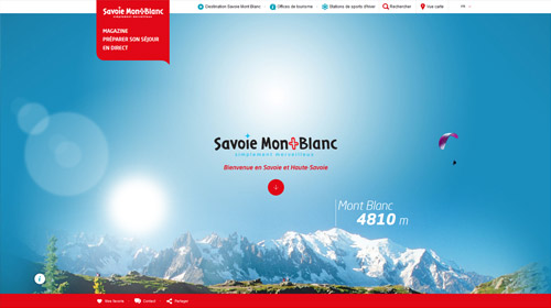 This website uses the "Parallax" système (a javascript trick with several grounds of pictures moving when scrolling), which plays with nice bacground photographs. This parallax homepage is good looking but contains almost only photos, and I think it's not so easy for everyone to see how to access the content pages. It could be a shame if the users don't visit these pages, because their content is really rich and interesting, with videos and interactive maps.
Created by Agence Interactive
To conlude this little selection, to websites created by the french (Lyon based) web agency Enyware (this great team learned me the basics of the job few several years ago). The art director is Julien Milliès (who just won a site of the day awwward with his brand new portfolio).
Temmos
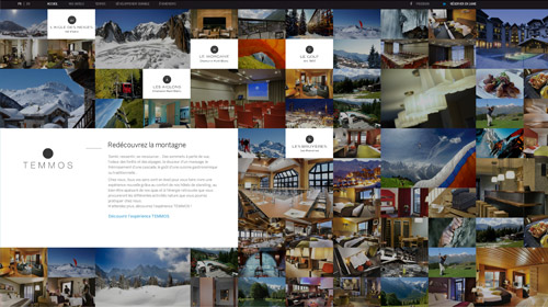 Introducing the different luxury resorts of the Temmos group, the website shows a nice pictures mosaic with a fluid and intuitive user experience.
Hôtel Aigle des Neiges
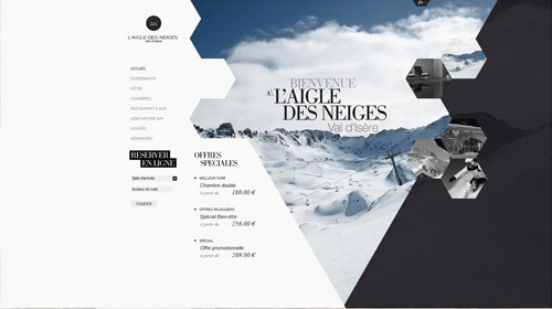 A luxury resort, member of the Temmos group. This website is really outstanding : innovative design, audacious layout, flash-similar user experience... a great work !
 Français
 English