Tag - typographie

Entries feed

Designforfun, graphic design made in Facebook

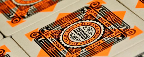
Designforfun is the online portfolio of Ben Barry, who's currently the official Facebook's graphic designer. Even if at first, Facebook seems a bit graphically poor, this portfolio shows a hidden part of the network's design. You'll find inside very carefully designed pictures, which have for me a special "american touch", particularly in the use of typography.
Ben Barry likes to play with a small number of colors and striking images. It's very interesting to see how he applies to Facebook his particular style and keeping in the same time functionnality.
Pictures and link in the rest of the article.

Continue reading...

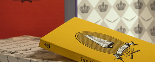
LOOVVOOL, luxury and branding

LOOVVOOL is an agency founded by Hannes Unt in 2004 and located in Hong Kong. Specialized into visual identity and branding (more specially luxury branding) the agency realised elegant and efficient logotypes and brandings. You can find agency's clients all around the world. More pictures and links in the rest of this post.

Continue reading...

Naomie Ross : type, motion, but print too

If you use to read and follow graphic trends blogs, you should have seen several times this beautiful video by Naomie Ross, detailing the process of a letterpress print. But talking about print, have you seen her printed works ? Surely not. Here we can see the limits of social networks and blogs : information just go around in circles, and you can find it several and several times without value added. Personally, I modestly try to go a bit farther than only repeating what other say, and that's why I've decided to talk in this post about Naomie Ross' printed works, which are worthy.

Continue reading...

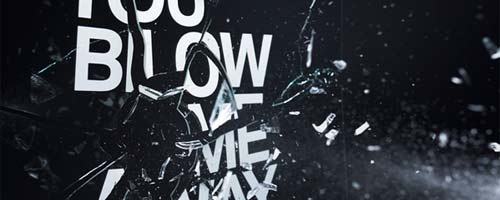
Words Are Pictures, a well-named studio

Words are Pictures is a studio founded by Craig Ward, a british graphic designer working in New York. Defining itself as an expressive and experimental typography studio, Words are Pictures' productions are mixing font design, illustration, and more artistic fields like sculpture. Each of their works is a search for coordination between the meaning and the form, in order to convey a stronger and richer message. Pictures and links in the rest of this post.

Continue reading...

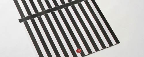
The Wedding Edition by Lasse Kusk

Lasse Kusk is a danish art director and designer, currently based in Germany. Working most of his time for interactive and web projects, he didn't give up the print and he realises very beautiful works like his wedding announcement, called 'The Wedding Edition'. He published it in Japanese and Danish, and he designed it like a real magazine. A black, white, and red design, emphasizing typography and mockups. Don't hesitate to have a look at his others works, which are full of inspiration. Pictures and links below !

Continue reading...

Type Union, typography, only typography

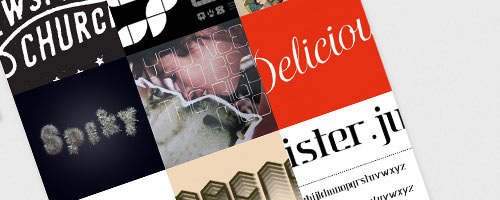
Type Union, a great website for typography inspiration, with a lot of works.

A little post about a website I just discovered via Twitter (by the way, don't hesitate to follow me) : Type Union. Created by two graphic designers having a passion for typography, this website provides a space only dedicated to this art. Several categories are available, like 3D, Experimental, Hand Drawn, Type design... The submission of a new work is extremely easy, and each project is limited to only 3 pictures and a short description. This allows a great diversity of works, in which we can see influences from illustration, graphic design or motion graphics.
An interesting website to find inspiration for new typographic compositions. By the way you can find my free font Mister Jun on Type Union on this page.
http://typeunion.net

- page 5 of 8 -