Tag - black-white

Entries feed

Lundgren+Lindqvist, swedish branding

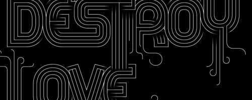
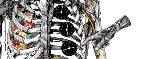
Lundgren+Lindqvist is a swedish design bureau based in Gothenburg. They mainly work on branding, including logotype design, graphic charts, printed or web communication tools, and even illustration. Even if the team is intentionally small, the bureau works with a large network of co-workers, including motion designers, copywriters and some very talented photographers.
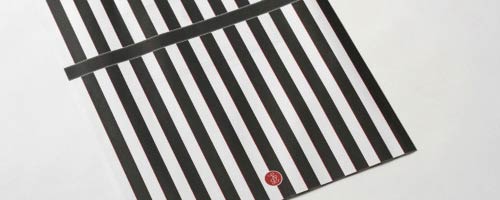
Their productions are characterized by a minimalistic approach of design, and a high consistency into a whole project. Brandings they create often plays with two or three colours, with geometrics shapes and a rationnal use of typography and layout grids.
Pictures and links in the rest of this post.

Continue reading...

Andreas Leonidou, from graphic designer to type designer

Web allows definitely great meetings, and I'm very happy to have this blog when I can publish articles like this one. I found on Behance the work of Andreas Leonidou, a graphic designer and font designer based in Cyprus. His typography works are very original and structured, featuring a real search for new shapes.
I was lucky to exchange some emails with him later, and I introduce his work today with a little interview about typography, graphic design, and about the design scene in Cyprus. Pictures, texts and links in the rest of this article.

Continue reading...

Music Video : Caffeine by Brandt Braueur Frick realised by Danae Diaz and Patricia Luna

It's a beautiful hand-drawn style music video that Danae Diaz (spanish graphic designer located in Berlin) and Patricia Luna (russian graphic designer working in Barcelona) realised to illustrate the music 'Caffeine' by Brand Braueur Frick. A kafkaian atmosphere in which robotic workers are endless repeating same gestures, same paths, symbolised by graphic elements from the urban work world like elevators, automatic doors, traffic lights... Even if a strange and stressing atmosphere is conveyed, I find it's perfectly adapted to the music. The end of the film is a bit strange and mysterious, if someone has an interpretation feel free to share it in the comments ! www.danaediaz.com
www.patricialuna.com

Via Creanum

Anatomic illustrations by Wataru Yoshida

Wataru Yoshida is a young japanese artist and graphic designer based in Tokyo. Through his work he creates a very personnal style using hand drawing, superimposition and high contrasts between coloured shapes and black lines. His illustration series called "Body>" is designed as a reflexion on the complexity and the structures of human body. To achieve it he mixes anatomic drawings with objects like ashtrays, cogwheels or clocks, giving his work a more artistic side. Wataru Yoshida works in some other fields too, like design with a concept of a shopping bag, or a clock.
More pictures and links below.

Continue reading...

The Wedding Edition by Lasse Kusk

Lasse Kusk is a danish art director and designer, currently based in Germany. Working most of his time for interactive and web projects, he didn't give up the print and he realises very beautiful works like his wedding announcement, called 'The Wedding Edition'. He published it in Japanese and Danish, and he designed it like a real magazine. A black, white, and red design, emphasizing typography and mockups. Don't hesitate to have a look at his others works, which are full of inspiration. Pictures and links below !

Continue reading...

Christmas in New York City, photo series by Maxyme Delisle

Maxyme Delisle is a canadian photographer based in Montreal. His personnal website shows his works in the fields of edition or fashion, for which he shot many pictures. But I would like to talk about a more artistic part of his activities, through this article about his series "Christmas in New York city". A series shot in winter 2007 when the artist was selling Christmas trees in the Big Apple.

Continue reading...

- page 2 of 4 -