Reid Miles, a vision of jazz music
Clément Romier | On Google + | Graphic Design - Permalink
In the days of digital, of mp3, of ITunes and downloading, the relationship between music and graphic design is getting less and less visible. It still exists, of course, and I presume it finds its future into video or interactivity. But if we have to compare to the visual richness of 50's, 60's, 70's and even the mid 90's, the musical graphic design of today is less rich and creative.
This eveolution not depends only on internet, because the raising of CD, with its more little display surface than vinyl discs, has restrained the graphic design expression surface. More over, some discs contained real edition works with posters, leaflets, allowing the designers and bands to really developp rich and detailed visual universes.
Today's young designers (like me), don't know for the most this interesting past of music design. However, it has create varied and experimental design, through the different music styles. It's in this objective that I introduced in an old article the Storm Thorgerson's work. Today I write this post about another great music designer, Reid Miles, who marked another music style, jazz music.
Reid Miles began to work in the early 50's as graphic designer for the american magazine Esquire. But it's in 1956 that his career took a big turn, when he entered the famous jazz label Blue Note, founded by Alfred Lion, Max Margulis and Francis Wolff. In charge of the covers design, Miles has develop a very original and personnal graphic language. Here I will try to modestly analyse this style, and to point up its particularities.
Photography as a raw material
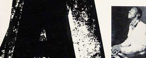
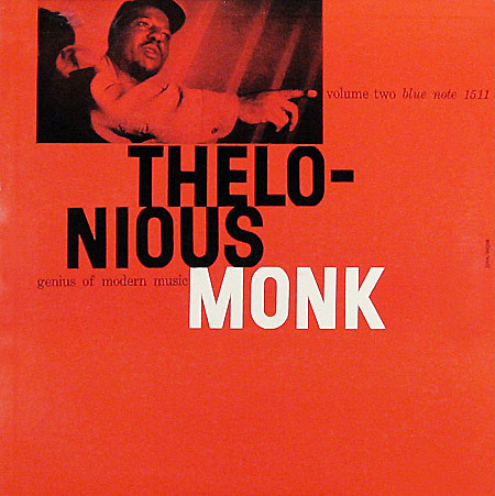
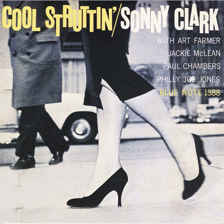
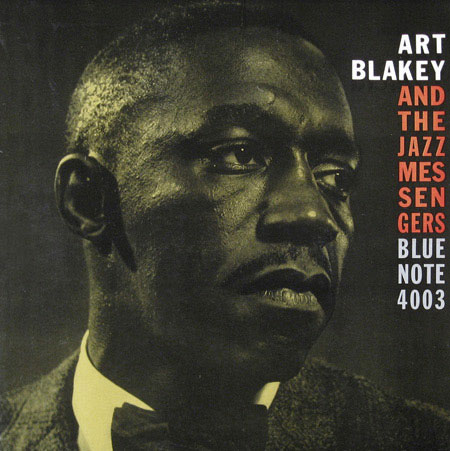
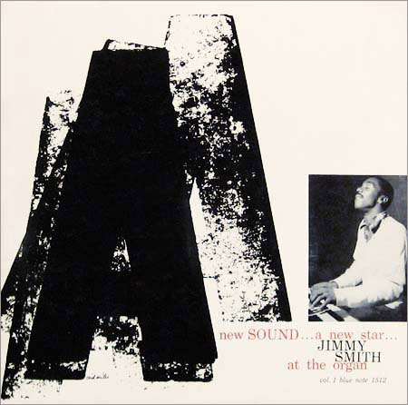
An important feature of a lot of Miles creations is the use of photography. Pictures used are great in themselves, and they were shot by Francis Wolff, one of the label founders, who was a photographer. Miles used this raw material in different ways :
• The picture, powerfull in itself, takes all the space of the cover, or almost all. Miles simply adds some little text blocks (often in vivid colour), in order to bring dynamism and play with the shot. Blank spaces into the photograph are also very important, because they allow the text to really communicate with the picture.
• The photography is included into a whole abstract graphic work, in which it is used sometimes as a texture, sometimes as a block (in the same way as text blocks). It is integrated as a graphic mass into the whole visual system.
We can also notice that the pictures, originally shot in black & white, are often teinted in vivid colours, giving the covers a coloured atmosphere, even if there are often only two or three colours inside.
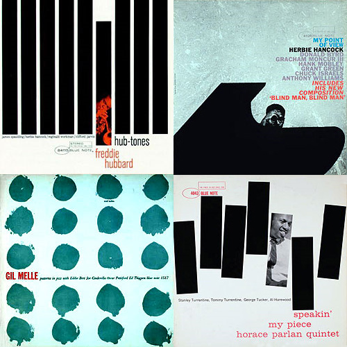
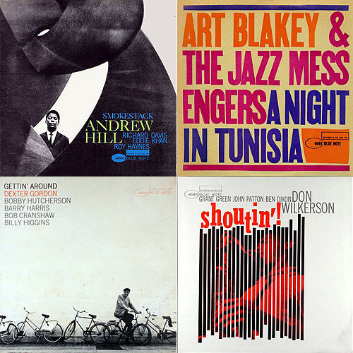
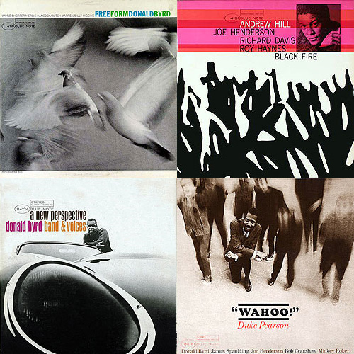
A visual abstraction
Another feature of Miles creations is a certain abstract, or even minimalism. Using only few different elements on a same picture, his visual economy could remind the experiments of the Bauhaus movement (precisely in the use of geometric shapes and photography), or the abstract expressionism which was raising in america at this time. Indeed, some aspects, like the importance of visual rythme and contrasts are similar in the work of artists like Franz Kline or Robert Motherwell.
But the fact is that Miles achieve to transmit visually the feeling of jazz music : unexpectations, abstractions and variations are some characteristics of this musical style, and we find them into the Blue Note covers.
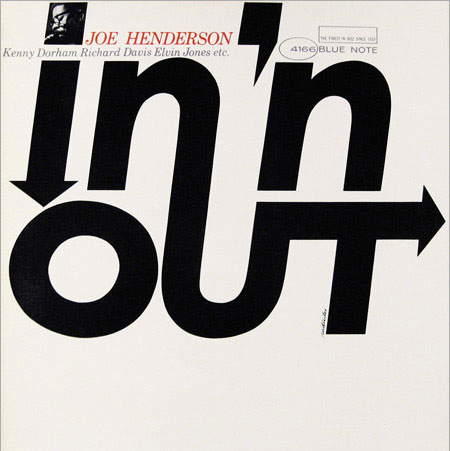
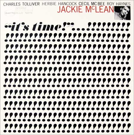
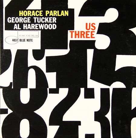
A typographic richness
It could seem easy at first to sum up the place of typography in Miles work. But if you think about it more precisely, you can notice that his use of font and texts is very varied. On some covers, he chose narrow and bold lineal font, with a great impact even in small size, and made it plays with the big background pictures. But in other cases he felt free to adapt the font, to reshape it, to cut it, in order to use it as a graphic object and no more as simple letters. In this way, some covers are particularly well designed, like by example Horace Parlan's Us Three or Jackie McLean's It's Time.
These reflections about Reid Miles work are of course to put into perspective, because it's always a bit reductive to define an artist or designer's style through a few features. But I think these characteristics have play a real role in the creation of a unique style, which gave an image, a colour to jazz music. To conclude by a funny note, I've read in some articles that Reid Miles didn't really like jazz music, and was much into classical. True or false, his work is still in amateurs minds a big part of jazz culture.
 Français
 English